Just how much worse is this flu season here in Australia, compared to other seasons? I’ve looked at this question twice before, over the past few weeks (see here and here for good background). Well it’s time to take another look – because the numbers are in for July 2009.
As I’ve discussed before, the Department of Health and Ageing have a “notifiable diseases report generator” that will give you a table of disease notifications, which is then easy to graph. So, I’ve run this generator for influenza notifications and got some interesting stats.
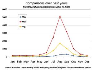
The first graph (below) shows the number of influenza notifications in Australia for the years 2001 to 2008 (8 years all up), by month. At each month in this graph I show three points:
- The bottom point is the minimum value for this month over the 8 years. In other words, I look for the year that had the lowest number of flu notifications for that month, and that’s the figure I plot. For example, if I choose the month of July, the year with the fewest notifications for flu was 2004, with only 96 notifications being made in the July of that year. So, I plot 96 as the minimum point for July.
- The top point is the maximum value for the month. For example, for the month of July, the year with the most notifications was 2007 (of all the July’s from 2001 to 2008). In that year, July clocked up 2,470 notifications. So that’s the number I plot for maximum.
- The middle point for each month is the average number of notifications for that month over all the years 2001 to 2008. So, for July we got an average of 770 notifications in that month for the years (2001 to 2008). So I plot 770 as my average.
Note that these are notifications for all types of flu (not just swine flu, which wasn’t around in its present form anyway):
You can double click on this graph to expand it.
The graph tells an interesting story (as I’ve remarked before). Flu notifications tend to peak in August. And there’s still a lot of flu notifications in Australia in September (on average, more than in July). In other words – we are not through the worst of our normal flu season yet.
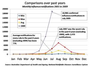
The next graph then becomes very interesting. All I’ve done is included 2009 monthly notifications in the above graph, as a fourth (purple) line. I’ve changed the scale to fit 2009 in. Here it is (again, you can double click on it to expand it):
 I think this graph tells the story well enough as to just how bad this season is compared to a normal season. The only caveat I would add to this is that we have clearly undertaken a lot more testing for flu in Australia this season than in a normal season. So some of the marked increase in notifications has to be due to an increased testing effect. Just how much – I don’t know.

Nice work, but not knowing how much is due to extra testing is frustrating! Is is possible to do these graphs with the number of hospitalizations rather than notifications?
thanks for all of your hard work!
Hi. Yes, I’ve been thinking that daily new hospital admissions would be a good figure. I can do that from the health updates – just need a bit of time. The closest I currently have is the graph showing the number of people who are currently in hospital – which is a good proxy for the effect of the flu in the community. But a more “live” measure would be daily new hospital admissions. So I’ll get on to it soon (next few days I hope). Thanks for the feedback. Cheers. Nick.
fascinating if not bordering on alarming figures albeit the anomaly in the reporting figures. However, what about mapping another figure – deaths according to influenza. I think this would add another dimension that would be most interesting.
Yes – good idea – I’ve been kind of holding off on that – but I think you’re right – it will also give a good trend. I’ll have a look.
I am enrolled in a MPH program at Louisiana State University Health Sciences Center in Shreveport, Louisiana. I am using this report for a class assignment for my Epidemiology class and I need to know what did you do to ensure the comparisons were fair?
Hi Toni.
Good question. I think by “fair” you mean “comparable”. That is, what’s in place to make sure that 2009 is comparable with previous years. As I remark, I’m not sure it is comparable, really, because I assume we are doing a lot more testing this year for flu than we have done in previous years. So we are bound to find more cases. Just how big that effect is, I don’t know.
Is this helpful?
Cheers
Nick